Edit Content

Responsive design that adapts smartphones, tablets, laptops & large screens

Build future-ready websites with our Responsive Web Design

Your website isn’t just an online address; it’s often the first handshake with your brand. With users reaching you from smartphones, tablets, laptops, and more, how do you guarantee a smooth, engaging, and high-performing experience across every single screen? We make that happen.

At Nexovah Technology, we specialize in building websites that adapt fluidly to every device, screen size, and orientation. Our responsive design approach combines performance, usability, and aesthetics to create web experiences that not only impress your visitors but also drive conversions and boost your search rankings.

Achievement Icon 3 points by Nexovah

Customers Rated Us Google, TrustPilot, Clutch

Trust Score Avg. 4.6/5

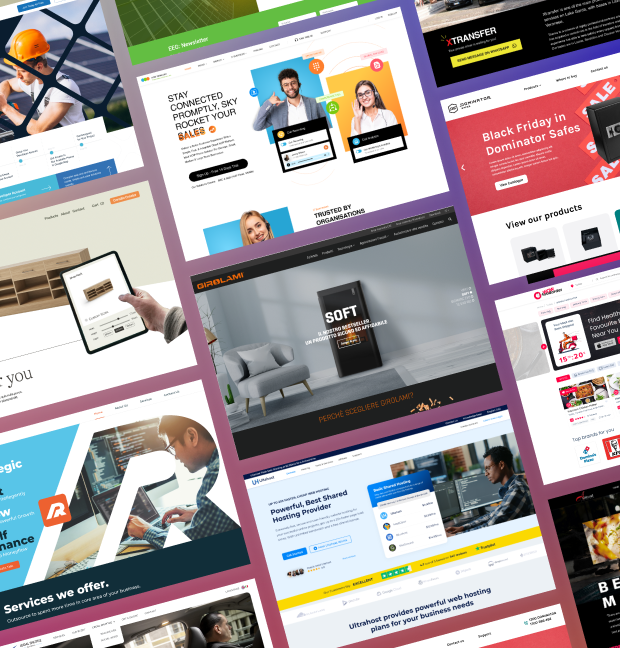
Why Your Business Needs Our Responsive Web Design Service

At the very beginning Responsive Web Design (RWD) ensures your website adapts seamlessly to any screen size using fluid grids, flexible images, and CSS media queries. Whether users visit your site from a mobile phone or a 4K monitor, they’ll experience smooth navigation, optimized visuals, and intuitive functionality. With over 60% of web traffic coming from mobile devices, responsive design is no longer optional, it’s essential. Google also rewards mobile-friendly websites with higher rankings, making responsiveness a key factor in both SEO and user engagement.

We then iterate relentlessly, testing and refining our designs based on continuous feedback. This collaborative approach ensures that the final product not only meets the user’s needs but also delights them in unexpected ways.

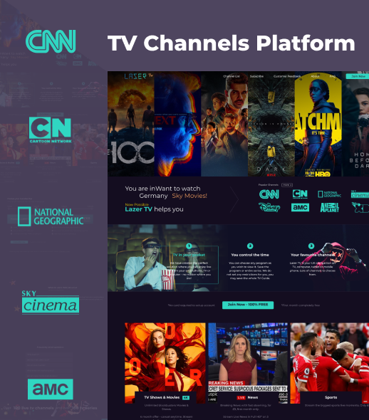
We produce Flexible, Fluid & Device Ready Layouts in Responsive Design which fulfils users need in each step.

We implement flexible layout, techniques as a core part of our responsive web design strategy. These layouts allow websites to dynamically adjust to various screen sizes, ensuring a seamless user experience whether viewed on a desktop, tablet, or mobile phone.
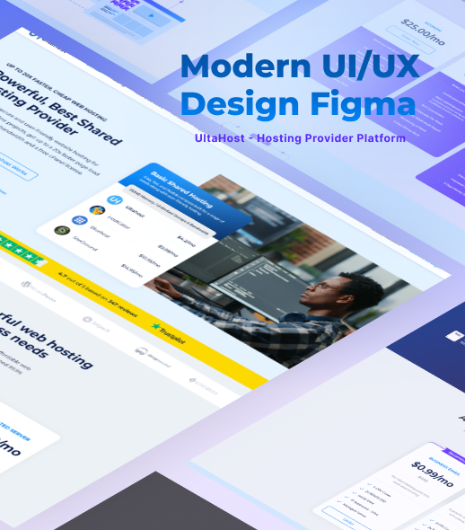
Flexible layouts are built using fluid grids based on relative units like percentages or em, rather than fixed pixels. This enables each element such as width, padding, and margins to scale proportionally, preserving the design integrity across different viewports.
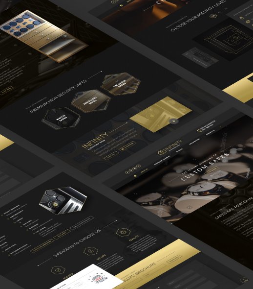
By combining flexible layouts with media queries and responsive images, we deliver websites that are visually consistent, highly accessible, and fully optimized for performance. The result? A site that not only looks good everywhere but also drives engagement
and supports SEO success.

Our Responsive Web Design Service benefits diverse Industry needs

We build future-ready websites that perform seamlessly across all devices, ensuring a consistent and optimal user experience.

Google's Mobile-First Indexing

A responsive website is essential for Google’s mobile-first indexing, which primarily uses the mobile version of a site for ranking and indexing. A single, responsive design ensures that Google can easily crawl and index your content, improving your search visibility and overall SEO.

A responsive website not only enhances usability but also supports SEO by offering a unified codebase, faster load times, and better engagement metrics—all of which are crucial ranking factors. A single URL for your content simplifies link building and reduces the risk of duplicate content issues.

A responsive design provides an optimal viewing and interaction experience for all users, regardless of their device. This creates a positive user experience, reducing bounce rates and encouraging visitors to stay on your site longer, which signals to search engines that your content is valuable.

With a responsive design, you only have one website to manage, which significantly reduces the time and cost associated with maintenance. Instead of updating two separate sites (one for desktop and one for mobile), you can make changes in one place, ensuring consistency and efficiency.

By providing a consistent and user-friendly experience across all devices, a responsive website helps to build trust and confidence with your audience. This streamlined experience makes it easier for users to complete desired actions, such as making a purchase or filling out a form, leading to higher conversion rates.

Responsive designs are built to be lightweight and efficient, which leads to faster load times on all devices. This is crucial for retaining mobile users, as they are more likely to abandon a site that takes too long to load. A fast-loading site improves user satisfaction and also positively impacts your search engine rankings.

Websites that perform seamlessly across all devices

Case Studies

Responsive Web Design Service Options

Whether you’re launching a new site or revamping an existing one, our design experts craft flexible, mobile-first, and SEO-friendly websites that offer exceptional user experiences across smartphones, tablets, and desktops.


We specialize in transforming underperforming websites into high-converting digital platforms. Our optimization approach includes

Seamless Website Content Migration

Migrating to a new website? We make it effortless. Our content migration service ensures your data is safely transferred, your SEO rankings are preserved, and your site remains responsive and user-friendly—on every device.

Responsive WordPress Website Development

We develop custom WordPress websites that are responsive, secure, and tailored to your business goals. From custom themes to optimized performance and protection, we handle it all. Service includes the following..

Tailored Responsive Design for Every Industry

From clean storefronts that boost sales and reduce cart abandonment to customer-focused B2C designs and lead-driven B2B platforms—each site is built to engage users and drive results.

Front-end Frameworks, Core Components for our Responsive Design

Front-end frameworks are structured toolkits that streamline the development of responsive and dynamic user interfaces in web applications. These frameworks include pre-written CSS, and JavaScript components, allowing developers to efficiently build, maintain, and scale complex UIs. By offering standardized design patterns, reusable components, and built-in responsiveness, they reduce development time and improve consistency across projects.

The frameworks that help us ensure cross-device compatibility and improve the user experience.

Bootstrap

A widely used CSS framework for responsive design with prebuilt UI components and grid system making it suitable for responsive design.

Tailwind CSS

A utility-first CSS framework that allows developers to build custom designs with a vast set of pre-defined classes. Widely used for React UI development.

Projects Completed

0 +

Competitor Analysis & Winning Strategy

0 %

Agencies & Clients

0 +

Cost Benefit & Support Assurance

0 X

Years of Experience

0 +

Consultation, Design & Prototype

0 UI,UX

Completely free 1st time domain, hosting or server configuration support *Included, no extra cost. Free server or hosting plan assistance as per the project size & visitors expected load. We work with Industry leading hosting companies such as AWS, Cloudflare, Digital Ocean, Godaddy, BlueHost, Hostgador, etc.

    Step 1 of 2

    Have a project idea in mind? Let’s get started

    What is 3 + 7 ? Refresh icon
    Please fill all required fields
    By clicking the button, you confirm your consent to the processing of personal data.